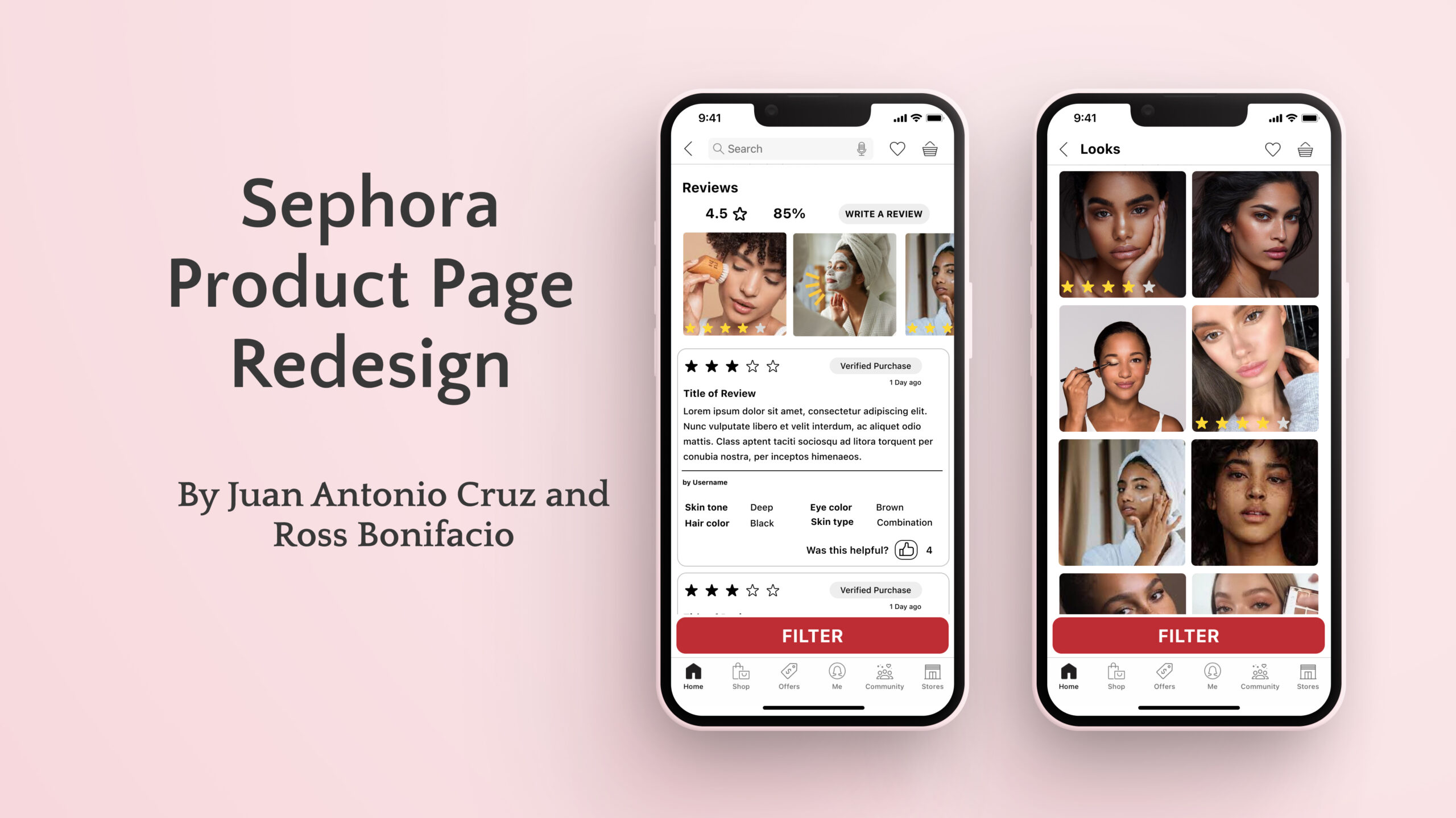
Unsolicited Sephora product page redesign – for QTBIPOC Design
By Juan Antonio Cruz and Ross Bonifacio
Role: Product Designer
User Research, Interaction, Visual design, Prototyping & Testing
Background
QTBIPOC is a nonprofit organization that provides LGBTQ+ designers of color with free and accessible education, mentorship, and networking opportunities. I am grateful to have been allowed to learn from instructors who worked and ran some amazing companies.
Overview
As half of a team, I worked on research, interviews, and design during QTBIPOC Design’s 12-week boot camp during the height of the COVID-19 pandemic. Led by working professionals focused on introducing and teaching UX Design to underrepresented groups.
Our goal was to look at a web app critically, in this case, Sephora’s, and find if and how it could be improved.
My team began by looking at Sephora’s web app, specifically the product page, and asking if there was something that we thought might be improved based on what we had just learned during our intro weeks of the boot camp. We felt that the app was crowded.
We then had to come up with a testable hypothesis, so we asked ourselves, “With Sephora’s current design, what is the goal? To sell the Product or Sephora?” We theorized that Sephora’s desire to sell itself might conflict with what its customers sought: information on a product. We thought that the app might have been overwhelming users with inconsistent UI and distractions as it tried to sell other unrelated products and Sephora-branded features to the detriment of the product consumers were looking at.
Hey there, this is the default text for a new paragraph. Feel free to edit this paragraph by clicking on the yellow edit icon. After you are done just click on the yellow checkmark button on the top right. Have Fun!
The Idea
Hey there, this is the default text for a new paragraph. Feel free to edit this paragraph by clicking on the yellow edit icon. After you are done just click on the yellow checkmark button on the top right. Have Fun!
Our Goal then was to give Sephora customers the product information they need in a simple easy-to-read way that avoids overwhelming them with unnecessary information. First, though we would have to find out if,1. Do users agree with our hypothesis? 2. What features and information users found useful?
The deliverables could be broken down into:
1. Find a presentable theory if our research confirms our hypothesis.
2. Present a wireframe of the more streamlined web app
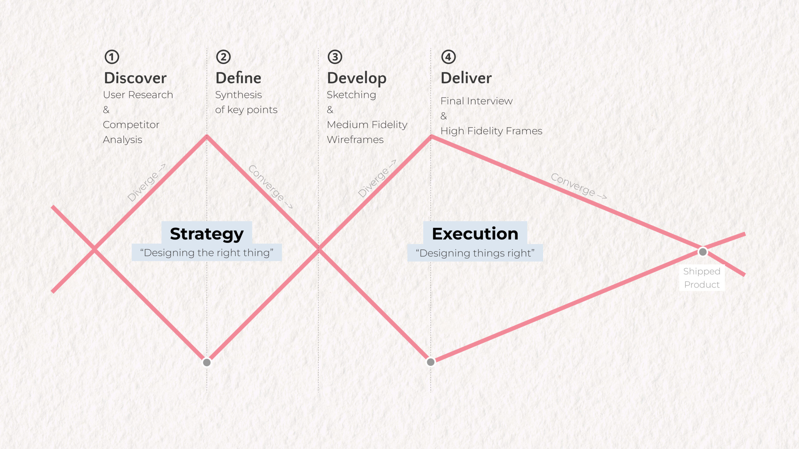
Because this was an instructor-led project we stuck to the basic Double Diamond design process.
Discovery
We began with high spirits my team member, Ross, was an avid Sephora customer and thought they had a pretty good idea of what other users wanted. We also took some time for a competitor analysis, it did seem like most had cleaner designs.
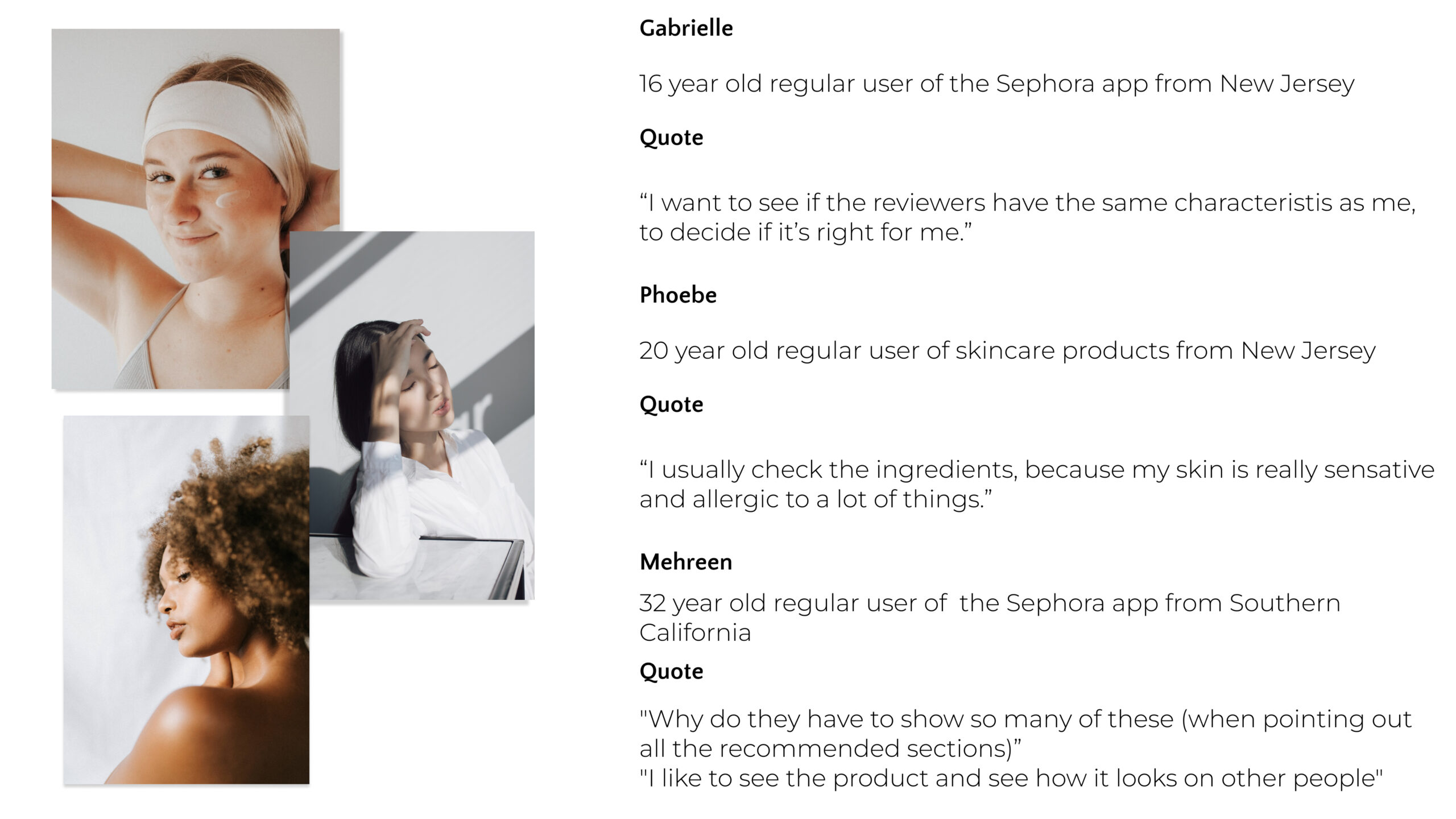
We decided to test our hypothesis with a simple survey for a random(ish) sample of users. The surveys were done in interview form over Zoom as we working during the pandemic.
Our process was: Ask the interviewee to pretend they were looking for a specific product, look up some product information then answer a few questions such as; Have you used the web app before? When do you use the app? When do you go to the store? What is most important for you when using the app? How difficult was it to find the product and product information? Is there anything about the app you would change?
Defining the Issues
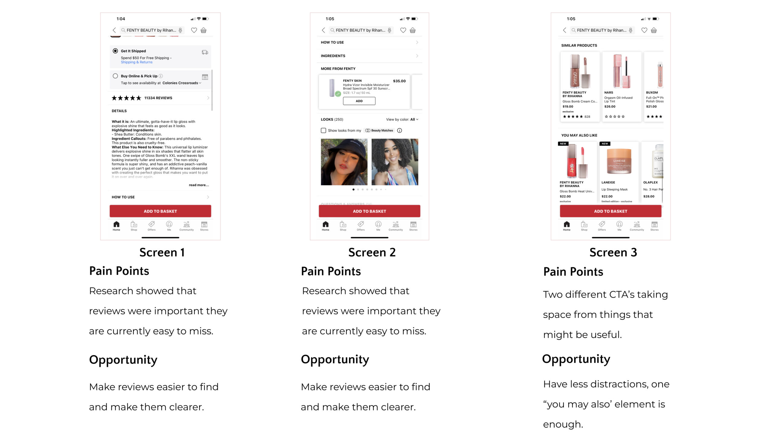
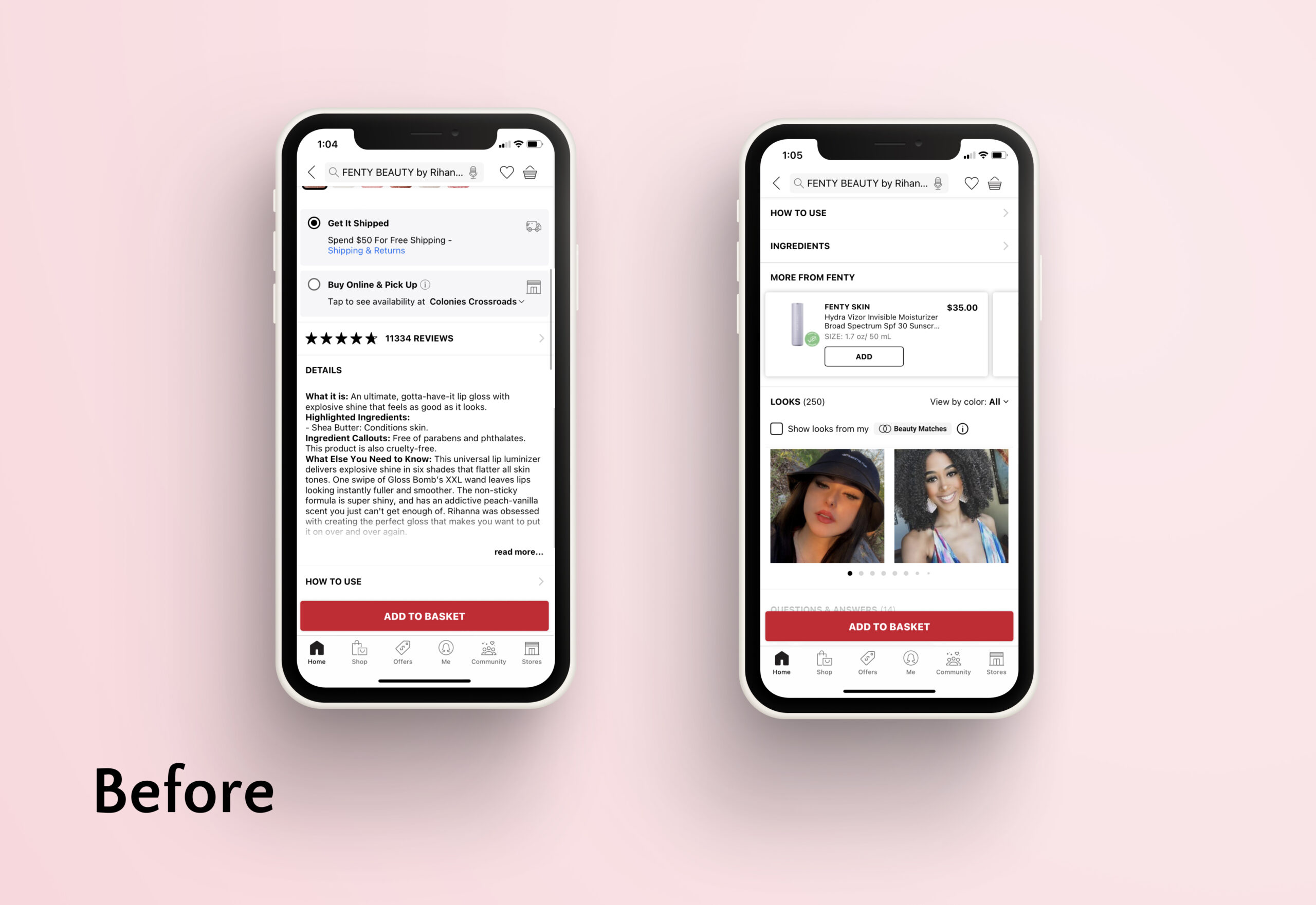
From the responses, we were able to confirm that users felt that the app was crowded, they also felt like the information they most wanted was hidden or hard to find. Many found the large amount of CTA’s (calls to action) overwhelming.
Additionally, we discovered a different use case between the Sephora app and the store. Customers were more likely to be looking for a specific product or specific information on a product on the app, they were more likely to want to browse and discover products at the store. Users also mentioned review sections as more important compared to other sections of the app they also rated the feature to see the product in use as very useful and expressed a desire to see those kinds of pictures more easily.
The following are examples of some of the issues we discovered.
Designs and Constraints
We used that information to begin sketching out a redesign of the Sephora product page, our idea was that by giving customers access to reviews, review images, and looks in one streamlined element with the ability to filter by skin tone, eye color, hair color, and more rather than having one element for each, we went straights to creating a medium-fidelity wireframe because of time constraints, sometimes Ux work isn’t as neat in practice.
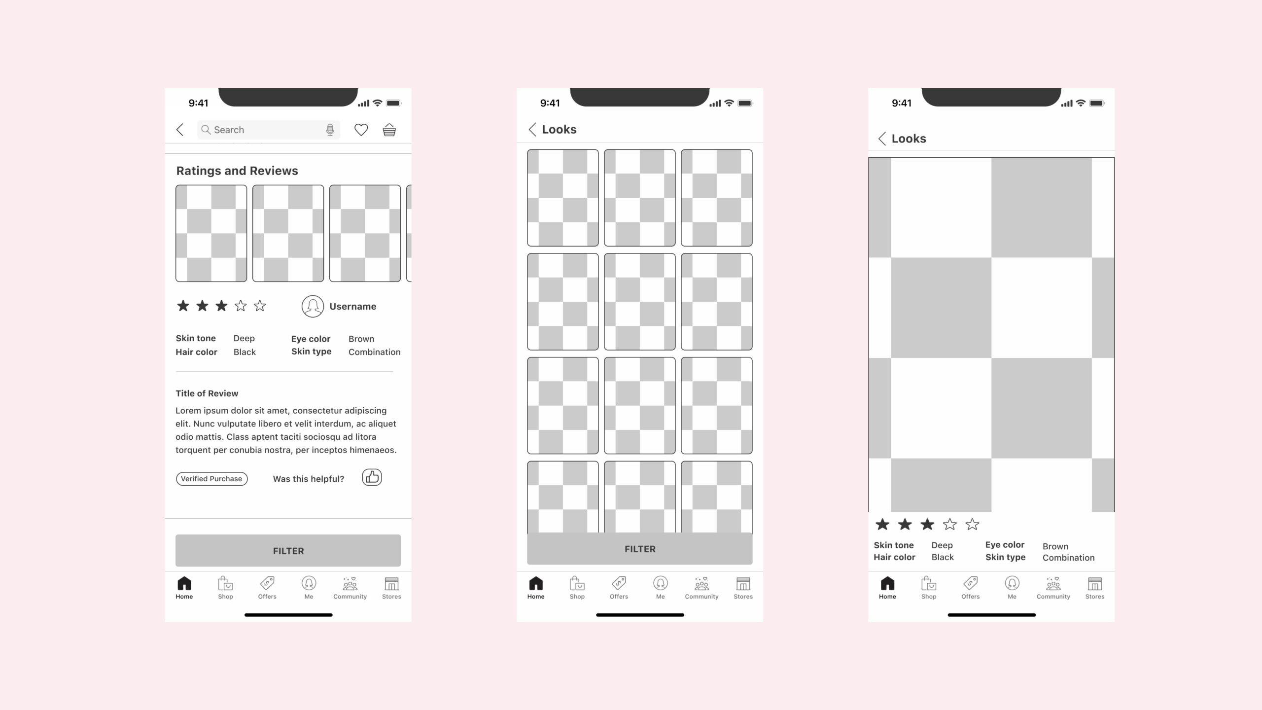
DELIVERY
We conducted a quick user interview of the new designs with our previous interviewees to see if our version was an improvement in the areas they mentioned before. This was nerve-wracking because of time constraints the polish of the wireframes left a lot to be desired, and we worried that it might negatively influence our tester's reactions to the designs. Another issue was we didn’t have time to create a prototype of any kind, so they would mostly have to go off images we sent them and showed them, and worse all this was done through Zoom.
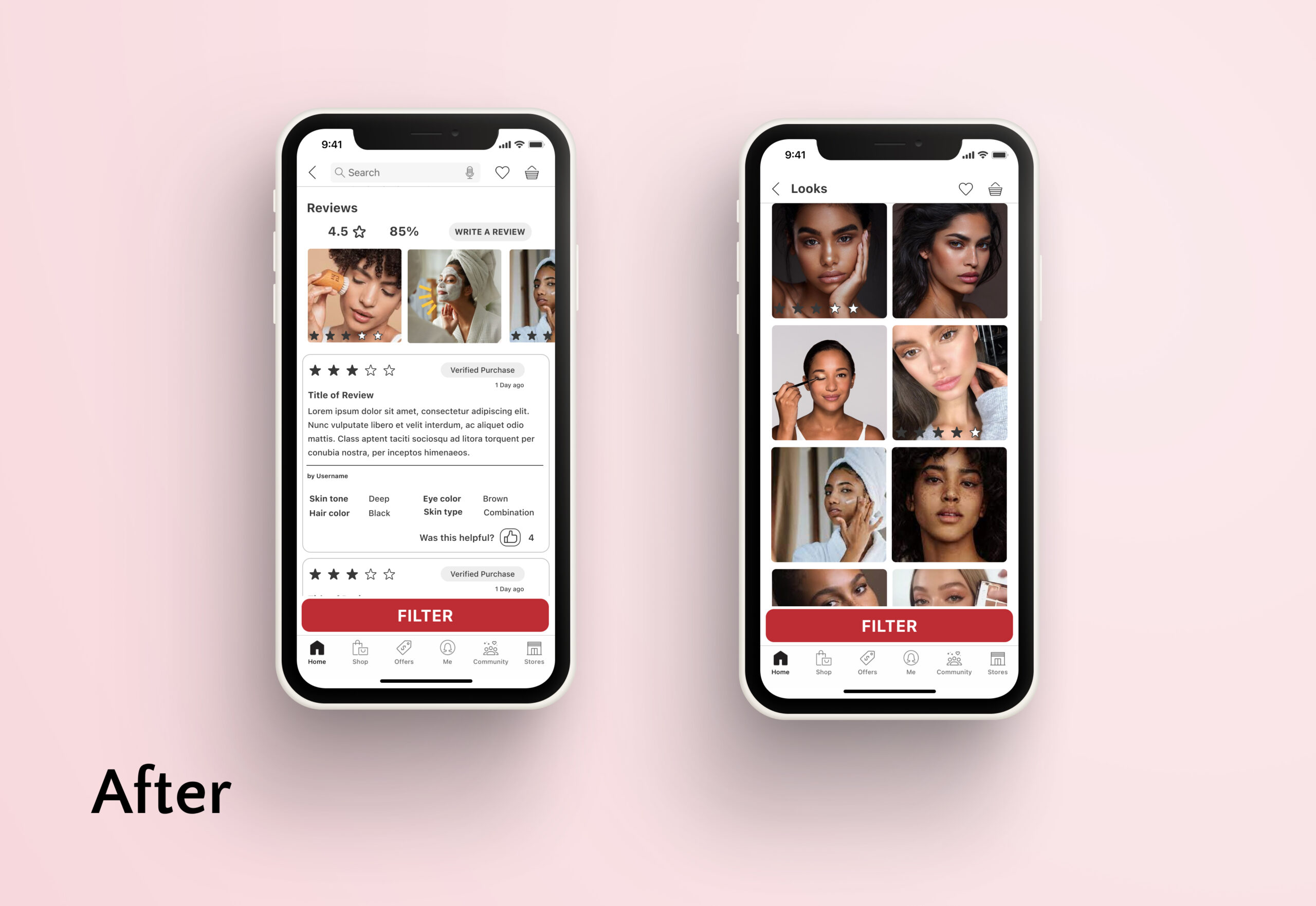
And of course, we were right, aesthetics, especially negative ones can affect the perception of the quality of the work, especially to users who are not aware of UX Design principles. Most of the testers mentioned that our design wasn’t quite “right” but when asked about specific elements like review sections and comparing they preferred our idea. We considered that mostly a win and created a more high-quality version to present to our cohort.
What We learned
When working with a reseller like Sephora with many different products it is important to balance between selling the product and marketing the seller. In this regard, we think the final iteration has merit, cleaning out some of the extra CTA’s and focusing on what our research showed users wanted. Ideally, we would continue doing user testing with our new design and further confirm how our changes influence users’ experience in deciding if a product is right for them. It does happen often that different stakeholders have different goals, and while users might want to find things quickly Sephora as a retailer is going to be interested in increasing the time spent on their pages. If we want to remove some CTA’s we would need to have data proving it would be financially beneficial for the company to do so.
Some key takeaways:
The Client’s users might want different things at different times, what a customer might want in a store could be different from what they want online.
Very often amongst UX Designers, you will hear how Aesthetics =/= UX, while true, that difference might not be apparent to a layperson. Having at least a clean look to your designs for tests can help your testers not be distracted from your actual test case.
When working in real life, timetables, teams, and research, might not be as perfect and step-by-step as we would like, It’s important to prioritize the questions we most need answers to and circle back to other issues when time, budget, and client permits.
